General Discussion
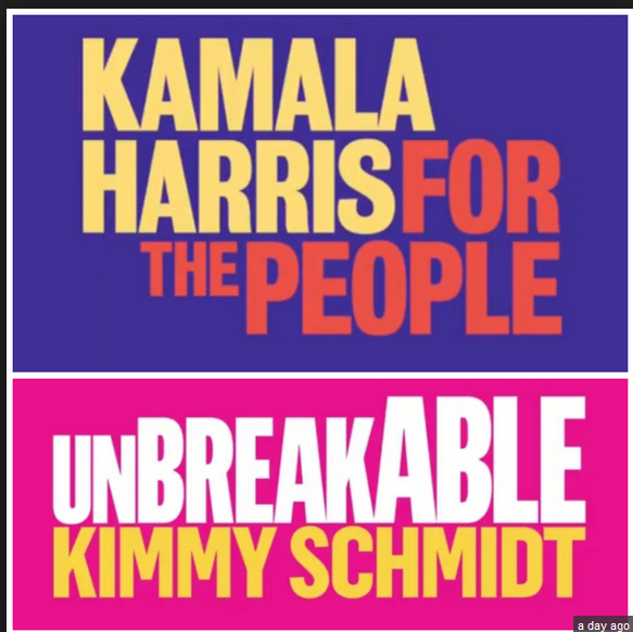
Related: Editorials & Other Articles, Issue Forums, Alliance Forums, Region ForumsKamala Harris's Logo Is a Disaster. Here's Why.
On paper, Harris, like Rubio, looks pretty formidable. And like Rubio, she has rolled out her campaign with a dumpster-fire logo. Seriously: It might be the worst political graphic design job in a generation:

...snip...
Everything changed in 2008 when Sol Sender designed a logo for Barack Obama that will probably go down as the most important piece of political graphic design in the last century. And I’ll bet the milk-money you remember it:

...snip...
What makes a good logo for a political campaign? As Robert Bresson notes, there are “Ten properties of a subject, according to Leonardo: light and dark, color and substance, form and position, distance and nearness, movement and stillness.” Maybe it’s not rocket science. But if it was easy, everyone would get it right. And it’s only when you master the unity of those elements that you get to genius.
Keep those precepts in mind when you look at campaign designs that work. Like, for instance, Alexandria Ocasio-Cortez’s fantastic poster, which was probably responsible for 5 points on Election Day all by itself:

https://thebulwark.com/kamala-harriss-logo-is-a-disaster-heres-why/
 = new reply since forum marked as read
Highlight:
NoneDon't highlight anything
5 newestHighlight 5 most recent replies
= new reply since forum marked as read
Highlight:
NoneDon't highlight anything
5 newestHighlight 5 most recent replies
Trumpocalypse
(6,143 posts)Should be red, white and blue.

brooklynite
(94,974 posts)Trumpocalypse
(6,143 posts)yet!
brooklynite
(94,974 posts)Trumpocalypse
(6,143 posts)Plus it was a different time.
brooklynite
(94,974 posts)
Trumpocalypse
(6,143 posts)Plus it was a very different time.
Trumpocalypse
(6,143 posts)


All red, white & blue.

underpants
(183,019 posts)The gold, yellow, mustard may be there for a reason.

Achilleaze
(15,543 posts)Trumpocalypse
(6,143 posts)Red and white

TheBlackAdder
(28,253 posts).
Look at these stupid inbred fuckers:
And, if you have an environmentally friendly car, this is what they do:
The one guy, with the American Flag on the back of this truck, loving his freedumb by shitting on the country.
.

womanofthehills
(8,808 posts)White would be boring.
Mr. Quackers
(443 posts)Or even reflex blue, simple 1 color design means print media (handbills, signs, buttons) are cheaper to produce and you can get more for the money.
OnDoutside
(19,986 posts)womanofthehills
(8,808 posts)
InAbLuEsTaTe
(24,125 posts)
musicblind
(4,486 posts)Also, is that a locked in logo for Harris or just the slogan?

aikoaiko
(34,186 posts)Last edited Wed Jan 23, 2019, 07:23 PM - Edit history (1)
If you turn counter-clockwise about 160* the red in the pepsi is on the bottom.
eta:

musicblind
(4,486 posts)
LisaM
(27,850 posts)and I also always thought it looked like it said "OZ" with a road in it. Bottom line, it didn't matter what I thought, millions of people loved it.
I like Kamala Harris, she's in my top two, but that's not a great logo.

ProudLib72
(17,984 posts)Ha! If that's what it takes to insinuate yourself into the public's minds, Kamala needs a slogan that is derivative of Coke.

brush
(53,977 posts)
Cattledog
(5,921 posts)At the end of 2006, Mode, a motion design studio in Chicago, approached Sol Sender, a graphic designer, to create a logo for Barack Obama’s presidential campaign. The resulting “O” became one of the most recognizable political logos in recent history. I spoke with Mr. Sender a few days after the election to discuss the evolution of his design.
Q: How many iterations did you go through before deciding on this “O”? Was it your first idea?
A: We actually presented seven or eight options in the first round, and the one that was ultimately chosen was among these. In terms of our internal process, though, I believe the logo — as we now know it — came out of a second round of design explorations. At any rate, it happened quite quickly, all things considered. The entire undertaking took less than two weeks.
https://campaignstops.blogs.nytimes.com/2008/11/20/the-o-in-obama/
KayF
(1,345 posts)i don't know anything about graphic design so I can't speak to the technicalities but I do know:
1. I like the logo
2. The bulwark is a conservative website
musicblind
(4,486 posts)I gotta be honest. I don't LOVE it. It's very... Helvetica... and the colors clash.
But, I also don't think it will be the final logo. Often logos change during campaigns. This looks more like a way to get the slogan out there. She's just starting this up.
Logos do change. Just a year ago, for about 24 hours, Trump's dumbass art department thought a T penetrating a P was a good idea...
EffieBlack
(14,249 posts)

On her website, it's a bolder, more dynamic logo which looks much better than the static yellow version.
"Kamala Harris for the People" is likely what she said in her court appearances as a prosecutor - that's often how the prosecutor introduces him or herself to the judge and jury" - so it has some resonance.
It surely won't be the permanent version since her message and logo will evolve over the next few months. But in the meantime, I think it's fine.
musicblind
(4,486 posts)I'm not a fan of Helvetica-esque fonts. I'm not sure what font it is, but it looks like an all caps version of Grotesque No 9: https://www.linotype.com/343522/grotesque-no-9-family.html
Not a bad font, but if the font itself is the logo, I prefer something that doesn't follow the Helvetica trend that is already used by everyone from Mattel to Best Buy to McDonalds.
But, not everyone is into graphic design, either. So, I'm looking at it through a very different set of eyes.
The colors in the original post were ugh. But I like the color duo in the top one and the bottom works because purple and orange are opposites on that color wheel, so they pull to each other.

honest.abe
(8,689 posts)Issue resolved!
EffieBlack
(14,249 posts)
jcgoldie
(11,658 posts)I like how she coordinates her outfits with her signs Good job Kamala! 
mcar
(42,467 posts)I'm not enamored of "for the people" cause I live in FL (even though Morgan & Morgan is a good Democratic law firm, the phrase is everywhere), but the overall design works.

athena
(4,187 posts)I like the logo even more now. Wow.
Just two days ago, I was neutral about Harris. Then I read a post here making vague insinuations about Harris without providing any specifics. That led me to read more about her. After watching the Maddow interview last night and learning the meaning of “Kamala Harris for the People “, I think I’m in love.

Cattledog
(5,921 posts) ?c=2&imbypass=on
 ?c=2&imbypass=on
musicblind
(4,486 posts)The yellow background was the problem.
I like the one with the yellow used in the font best.

LeftInTX
(25,794 posts)
Hermit-The-Prog
(33,552 posts)Both the Obama and the Ocasio logos feature staring eyes. O--O
We may be a long ways from cave dwellers, but we still pay attention to those eyes of the predator on the hunt. Ocasio went further and added the whites of her own eyes -- you have to notice that or risk being eaten by a saber tooth tiger.
Ocasio's poster is dynamic and resembles the posters I used to see stapled to utilty poles, announcing an upcoming wrestling match or county fair.
KayF
(1,345 posts)about the eyes.
underpants
(183,019 posts)Spot on.

jpak
(41,760 posts) musicblind
(4,486 posts)Last edited Tue Jan 29, 2019, 01:09 PM - Edit history (1)
As someone who has spent a lot of time in graphic design, I'd prefer something a bit better, because she is my favorite declared candidate, so far. However, I don't think this will be the final logo. I think this is a starting point meant to emphasize the slogan.
That's why she used a simple sans serif font, Grotesque No 9, I think, so the words would stand out at a glance and in nearly all font sizes.
Actually, it might be Balboa: https://fonts.adobe.com/fonts/balboa-plus
I'm not sure. The Grotesque No 9 and Balboa fonts both have such similar R's.

pangaia
(24,324 posts)
Gidney N Cloyd
(19,847 posts)
Hoyt
(54,770 posts)I guess she can use, but I'll always think of those late night law firm ads.
I'm sure if they haven't already, they'll test it out. In fact, this may be a test.
WeekiWater
(3,259 posts)Every Floridian knows Morgan and Morgan. They dump huge money into Florida politics for anyone who supports medical marijuana or legalization. They do a bit more than that but marijuana is really where most of John Morgan’s spending goes. He does it all from writing ballot initiatives, getting them on the ballot, and then spends millions of his own money to try and get it passed.

marylandblue
(12,344 posts)
Renew Deal
(81,899 posts)So things like this are going to keep popping up
Awsi Dooger
(14,565 posts)Representative of overall level. That's why it is not surprising in the least. I agree that Kamala Harris will likely trot out one disappointing example after another, no matter the variable.
We need someone with extraordinary ability who would have had a wow logo and slogan ready on debut. That slogan should transcend politics and have staying power. I always think of Apple's "Think Different" as an awesome slogan. I have suggested "Remarkable You" as Democratic slogan. Tell somebody you think they are remarkable. Don't act like you are walking back and front of them while they are seated in a jury box.
Response to Renew Deal (Reply #23)
SharonClark This message was self-deleted by its author.
wut?
mcar
(42,467 posts)Renew Deal
(81,899 posts)There is a certain packaged feel to her. She has some positives and will have her moments, but I think she will have difficulty connecting with enough people to win. She reminds me of O'Malley 2016, Hillary '08, and John Edwards.

obamanut2012
(26,183 posts)Awsi Dooger
(14,565 posts)My concern all along is that she lacks good instincts, which can really be problematic in a 1-on-1 long general election cycle. A politician with good instincts would have rejected this logo with a laugh and demanded to speak to the person who created it, before removing them.
I am willing to see how she comes across in the debates and primary campaign. Maybe she'll be more likable than I expect. Maybe she can prove to be something other than a bulldog type during questioning.
This is not a good first step.
Besides, the slogan sounds like something that popped into her head immediately and nobody bothered to step back and look at it. For all his atrocities, Trump had a great slogan, with a positive theme.
"For the people" sounds like she thinks the entire world is sitting in a jury box.
I hope that is not what she brings. This is not a slam dunk cycle. Ousting an incumbent whose party has been in power only one term is the most difficult task in American politics. We cannot afford to have a prosecutor type without spark and who wrongly looks at this as a slam dunk case, the type of thing that blew the O.J. Simpson case and Robert Durst case.

SharonClark
(10,014 posts)Are any of them good?

slumcamper
(1,608 posts)
obamanut2012
(26,183 posts)slumcamper
(1,608 posts)obamanut2012
(26,183 posts)I am very, very Left, much more so than most on DU, and it was jsut something to snark about Hillary on. Well would anyone want the arrow to point backwards>?
MrsCoffee
(5,803 posts)I thought you weren’t even tuned in.

Just an excuse to snark. Boring.

lapucelle
(18,408 posts)What a shame that the "hidden meaning" arrow narrative gained traction with third party voters and those looking for an excuse to sit out the election. It helped put Trump in the White House.
slumcamper
(1,608 posts)Yes, the red-right arrow matter reflects a larger point, i.e., the force of a symbol relative to ideological alienation. Perhaps minor in the larger scheme, it was one of countless reasons Individual 1 sits in the WH. Sadly, this one was within our control. Whoever designed that thing messed up royally in the messaging. Or perhaps I wasn't finely tuned in because Bernie spoke more directly to my beliefs and public policy concerns. FWIW, I eventually works and voted without reservation for Hillary.
Perennially prescient is the principle often stated by Obama: "We must not let the perfect be the enemy of the good." And HRC would have been very, very good on everything that matters.
Too many people get distracted by the weeds of social media, disengage, and lose sight of the BIG PICTURE. Gotta keep the eyes--and mind--on the prize.
lapucelle
(18,408 posts)enough to inspire them to cast a third party vote or to stay home who messed up royally. It appears that they may have been among the useful idiots targeted by Russian messaging.
I liked the logo.
obamanut2012
(26,183 posts)brooklynite
(94,974 posts)Drum
(9,214 posts)...were to harken back to themes/materials chosen for Shirley Chisholm's campaign for President.
There appear to be reasons for the choices of this initial layout.
Need we snipe at everything, immediately?

Clash City Rocker
(3,402 posts)If she shows appropriate contrition, perhaps we’ll allow her to stay in the Senate.
(Her logo? Seriously? “Disaster?” Is there a swastika there that I can’t see? Get some perspective, people.)
brush
(53,977 posts)The colors can and will change. I like how the phrase "For the People" pops and gets your attention.
Most critics here have no idea what they're talking about.
blueinredohio
(6,797 posts)brooklynite
(94,974 posts)
Sanity Claws
(21,866 posts)Also it is all text no logo. My humble opinion as to why it is wrong/ineffective.
athena
(4,187 posts)Look at how the colors are positioned. It is a logo.

crazycatlady
(4,492 posts)Although TP is designed to clean up shit, not stir it.
greymattermom
(5,754 posts)but in my mind, it's Morgan and Morgan.
honest.abe
(8,689 posts)Not a make or break issue.. imo.

OilemFirchen
(7,143 posts)Can't she do everything wrong?
lapucelle
(18,408 posts)OilemFirchen
(7,143 posts)I was really hoping that this bullshit passive-aggressive "commentary" was dealt a death blow in 2016.
Of course, I consider the source...
lapucelle
(18,408 posts)...they were utterly bewildered by the power of the magic arrow.

UniteFightBack
(8,231 posts)
EarthFirst
(2,906 posts)It would be comical if it weren’t for it affecting the lives of those who really don’t have the time to quibble over the font of a political campaign advertisement.

violetpastille
(1,483 posts)
namahage
(1,157 posts)
rogue emissary
(3,148 posts)From the concerned post about her race to the colors in her logo. 2020 is going to be a cluster F*!k. 
lapucelle
(18,408 posts)
brooklynite
(94,974 posts)"Sol Sender designed a logo for Barack Obama that will probably go down as the most important piece of political graphic design in the last century"
namahage
(1,157 posts)About AOC's poster:
And then there’s something else about it that that hints at revolution and power and “The People” and if you’re under a certain age you might not be able to put your finger on it but—oh hey there!

Codeine
(25,586 posts)Seriously, that’s some weak sauce.
namahage
(1,157 posts)Funnily enough, this author ranked Kamala #2 in his "Democratic Power Rankings," behind Bernie Sanders.
I'm sure he's full of concern about one of the Democratic primary frontrunners.
ETA link: https://thebulwark.com/may-the-odds-be-ever-in-their-favor/

MineralMan
(146,351 posts)I'll have to go and look at who was dissing the Hillary logo.
"Who they are, I think I know.
Their house is in the village though..."
LeftInTX
(25,794 posts)Looks like a high school class president campaign sign.
Too much dead space .
Just for fun, they could make a great big K and the K could be kicking around baby Trump
MoonRiver
(36,926 posts) 
Blue_playwright
(1,568 posts)Not that Kansas is bad, but being from Oz, it reminds me of the shape of the state and the colors are either Midwestern or they are a bit like they came out of a King Cake in NOLA.
I don't like it either. All these creative folks in our party? There's no excuse for NOT living up to Obama for any of our team.

shenmue
(38,506 posts)I promise you, zero people in reality have a problem with this.

GulfCoast66
(11,949 posts)That discusses issues over their logo?
Things that make me go Hummm.
brooklynite
(94,974 posts)I have a friend who ran for AG in NY some years back. I had great respect for his experience and policies. But his campaign logo was red letters on a blue background. Consequently, you couldn't read the thing from more than 20 yards away.
I want a candidate who clears the baseline requirements, then we can have a discussion of policies and issues.
jcgoldie
(11,658 posts)"I want a candidate who clears the baseline requirements, then we can have a discussion of policies and issues."
Your criteria is shallow and trivial.
musette_sf
(10,209 posts)and have already ordered some campaign swag
athena
(4,187 posts)Did no one else notice it? Look at the colors and how they’re positioned. I think it’s clever, simple, and elegant. And I’m an artist.
dustyscamp
(2,228 posts)

MrsCoffee
(5,803 posts)LeftInTX
(25,794 posts)(I looked at Chisholm logos and posters and don't see a connection)
But someone on Reddit saw a recent connection:
Gothmog
(145,894 posts)
yuiyoshida
(41,871 posts)

nini
(16,672 posts)I hope I live long enough to see the shallowness of this kind of thing not even crossing people's minds. The fact someone actually wrote an article about this continues to prove how stupid this country is.

KY_EnviroGuy
(14,500 posts)and go to war with our fellow man over bullshit......
TeamPooka
(24,296 posts)onetexan
(13,080 posts)I like Kamala's logo just fine. Its quite appropriate and meaningful given her extensive background in law and judicial service.
obamanut2012
(26,183 posts)I never got the applause for Obama's, and still don't care for it.
samplegirl
(11,525 posts)Is Blah!!!!
muriel_volestrangler
(101,412 posts)An attempt to fit only vaguely connected words together while making some of them big. Not, I'd say, something giving a message.
