General Discussion
Related: Editorials & Other Articles, Issue Forums, Alliance Forums, Region ForumsI need your opinion in a poll!
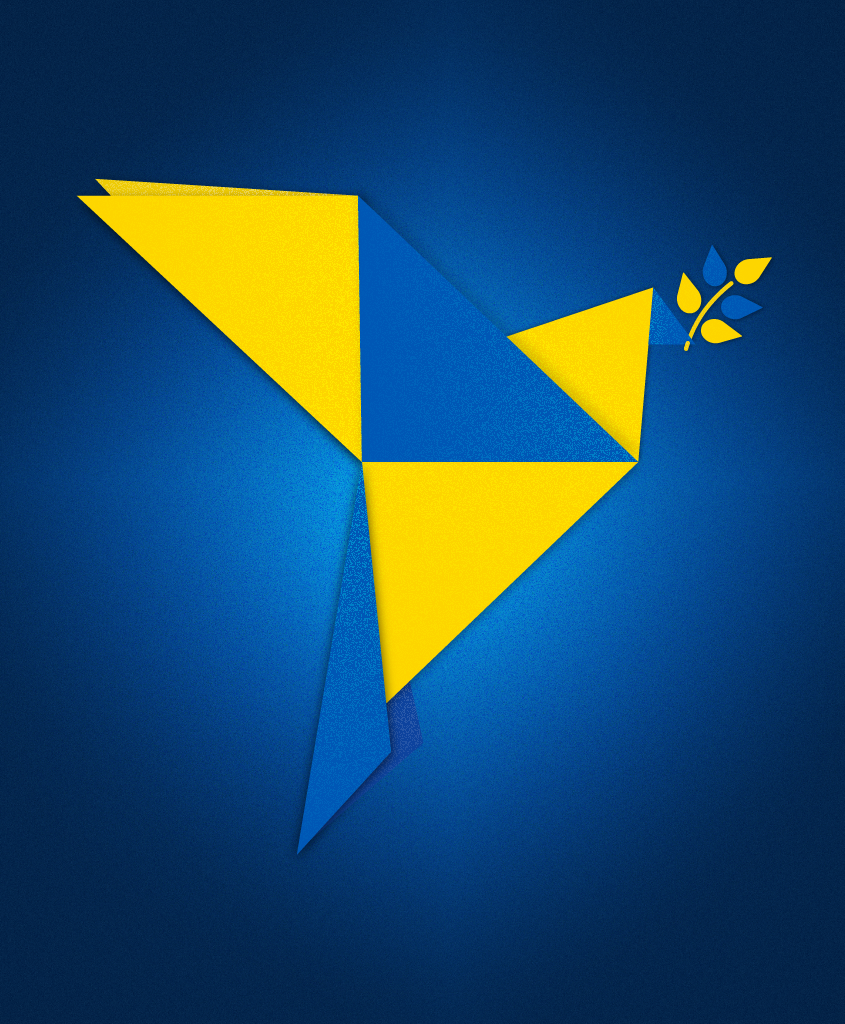
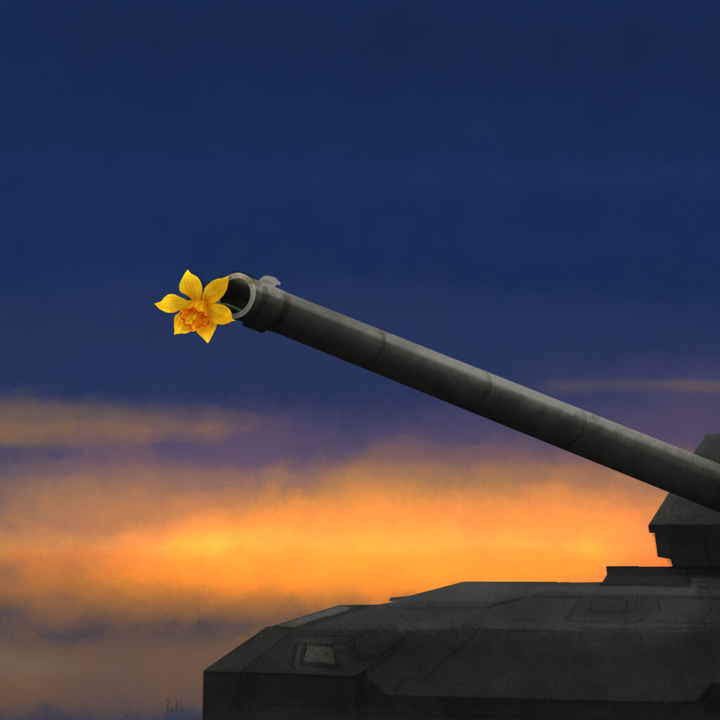
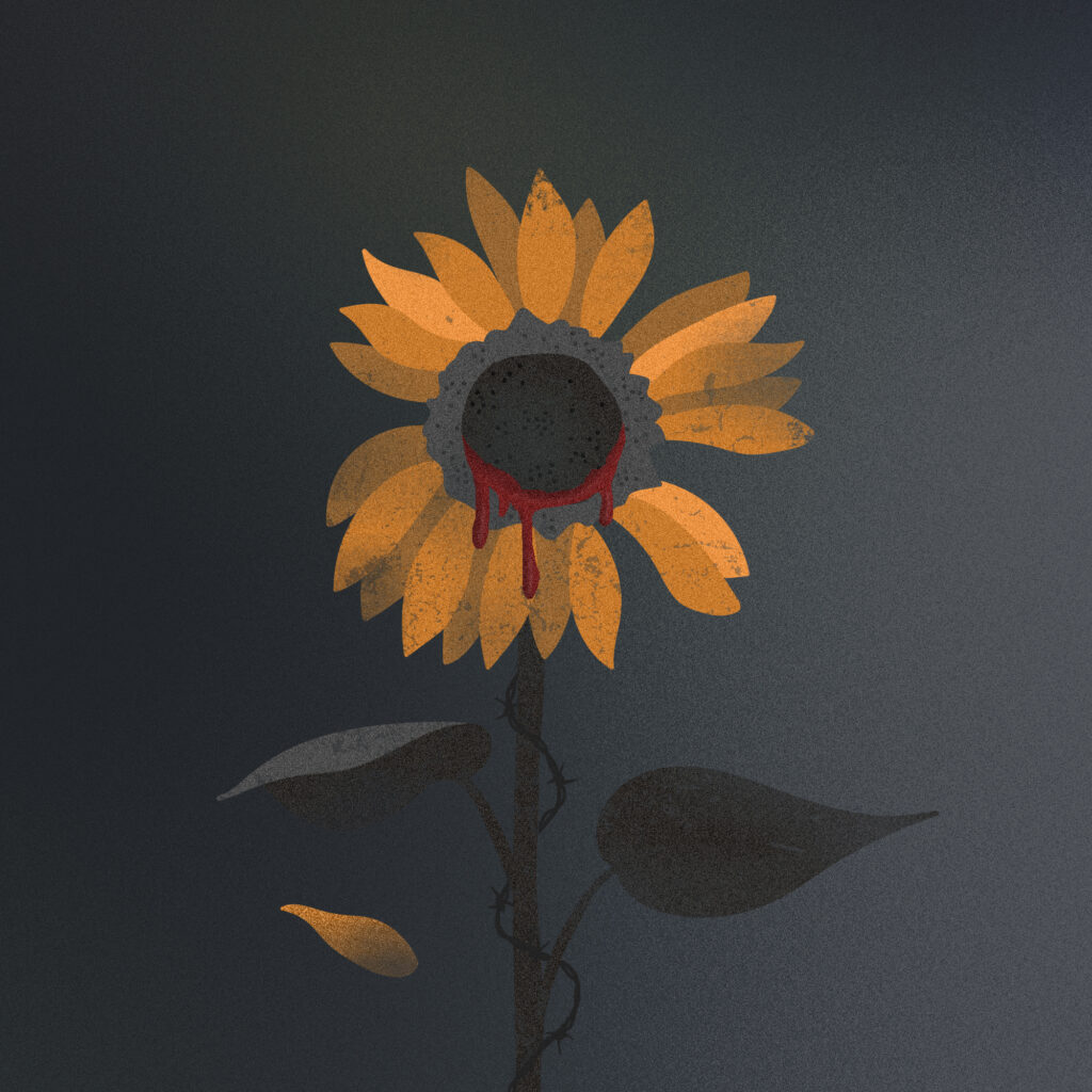
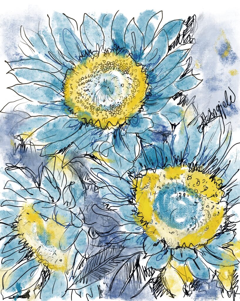
Our OFFICIAL DU Ukraine fund needs a logo. Here is the only logo submitted so far by DUer usonian. Should we keep it as is, or look for more?

| 20 votes, 0 passes | Time left: Unlimited | |
| I like the logo as is | |
19 (95%) |
|
| I don't like the current logo | |
0 (0%) |
|
| Keep trying to get more choices | |
1 (5%) |
|
| I know somebody and will have them try to make a new one | |
0 (0%) |
|
| Other (please explain) | |
0 (0%) |
|
| 0 DU members did not wish to select any of the options provided. | |
| Show usernames
Disclaimer: This is an Internet poll |
|
 = new reply since forum marked as read
Highlight:
NoneDon't highlight anything
5 newestHighlight 5 most recent replies
= new reply since forum marked as read
Highlight:
NoneDon't highlight anything
5 newestHighlight 5 most recent replies

secondwind
(16,903 posts)Response to Omaha Steve (Original post)
2naSalit This message was self-deleted by its author.

herding cats
(19,569 posts)I'd keep it as is. It fits the intention and speaks to us here. I even approve of the font, and I'm picky about such things having spent years building advertising.
Earth-shine
(4,044 posts)Try to equalize the blank yellow area on the top, bottom, left, and right.

Omaha Steve
(99,981 posts)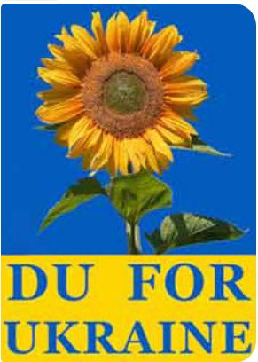
Earth-shine
(4,044 posts)It seems a bit cramped now. I think you took too much margin (blank space) away.
Put some more yellow margin back in on the top, bottom, left, and right of the text (or shrink the font).
I think you need some more blue margin for the flower, in particular, on the top.
This image is not sharp like the last one.
Overall, I think it's a great design. 

2naSalit
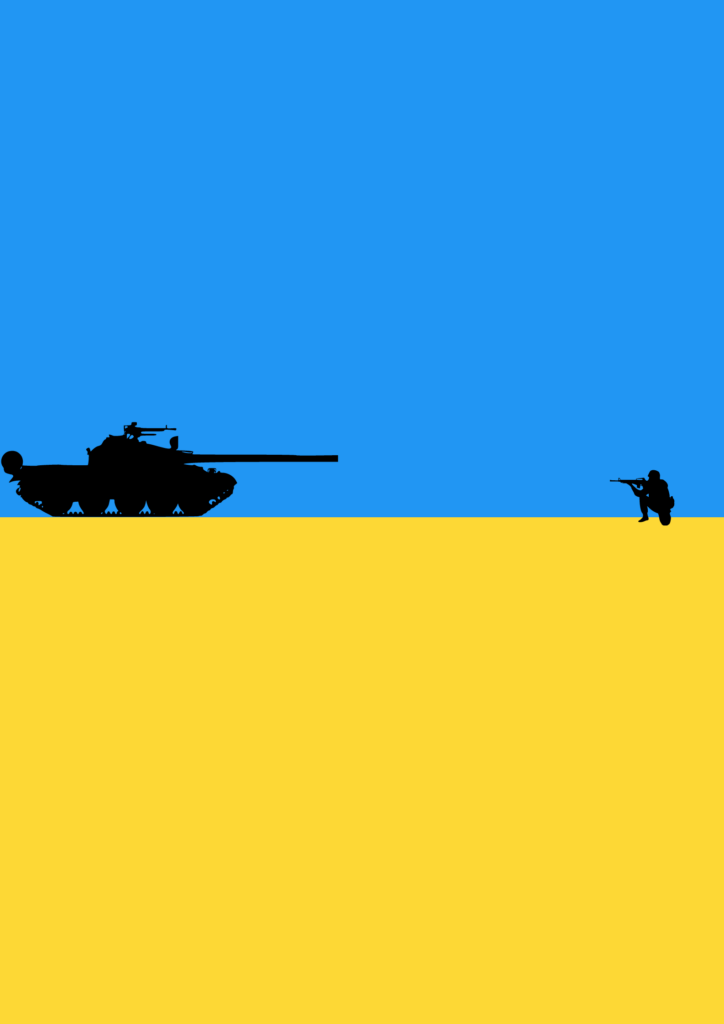
(87,122 posts)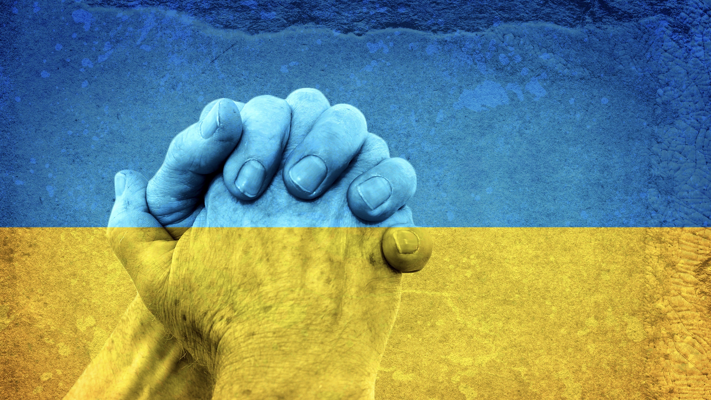 ?w=1280&h=720&crop=auto
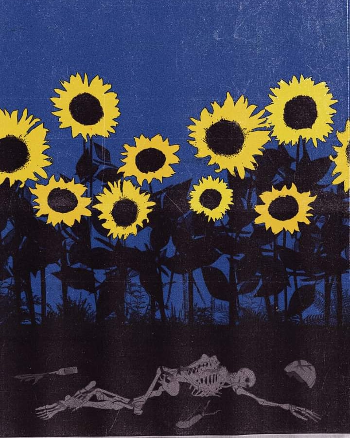


Donkees
(31,585 posts)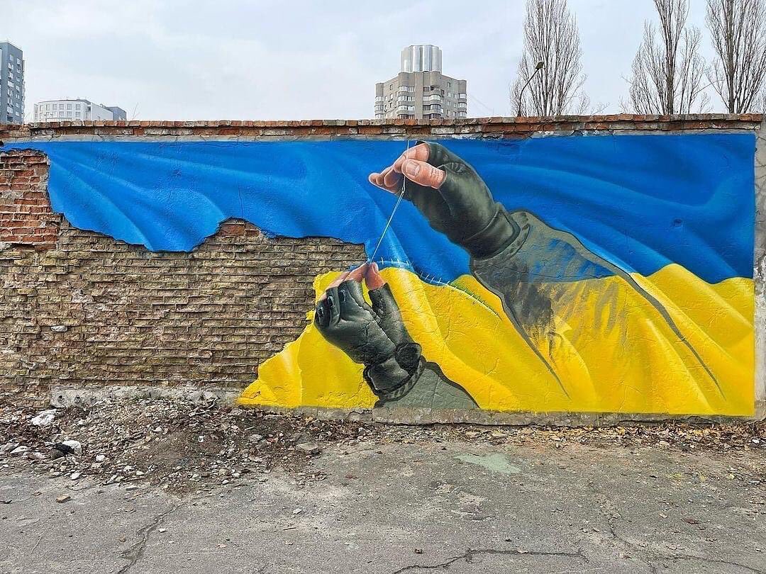
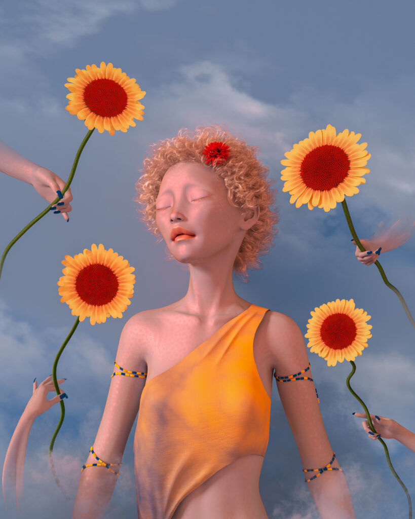
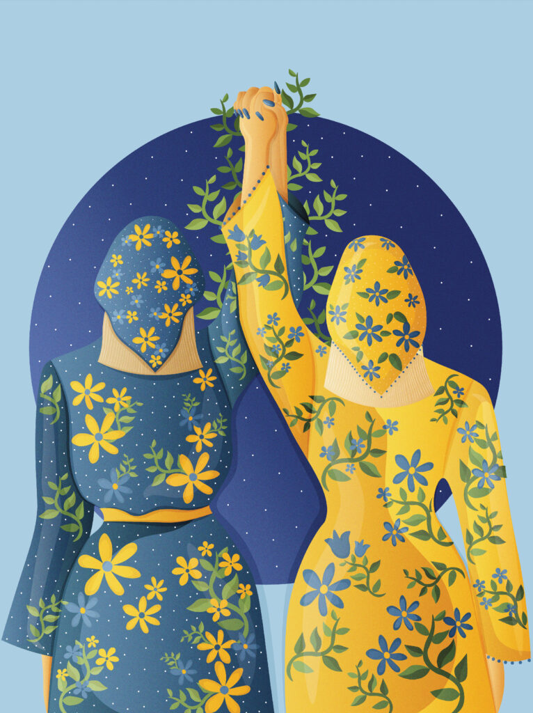
electric_blue68
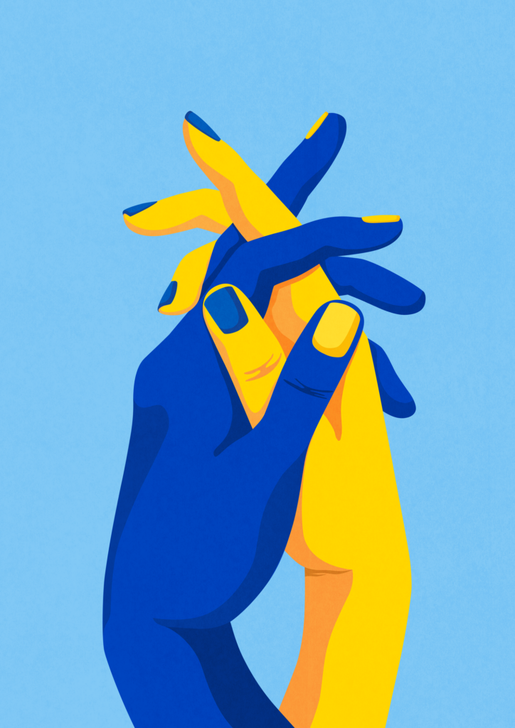
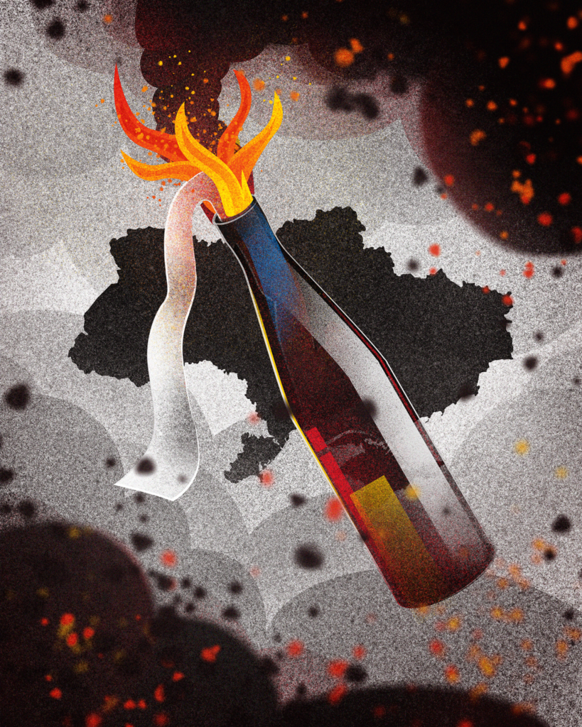
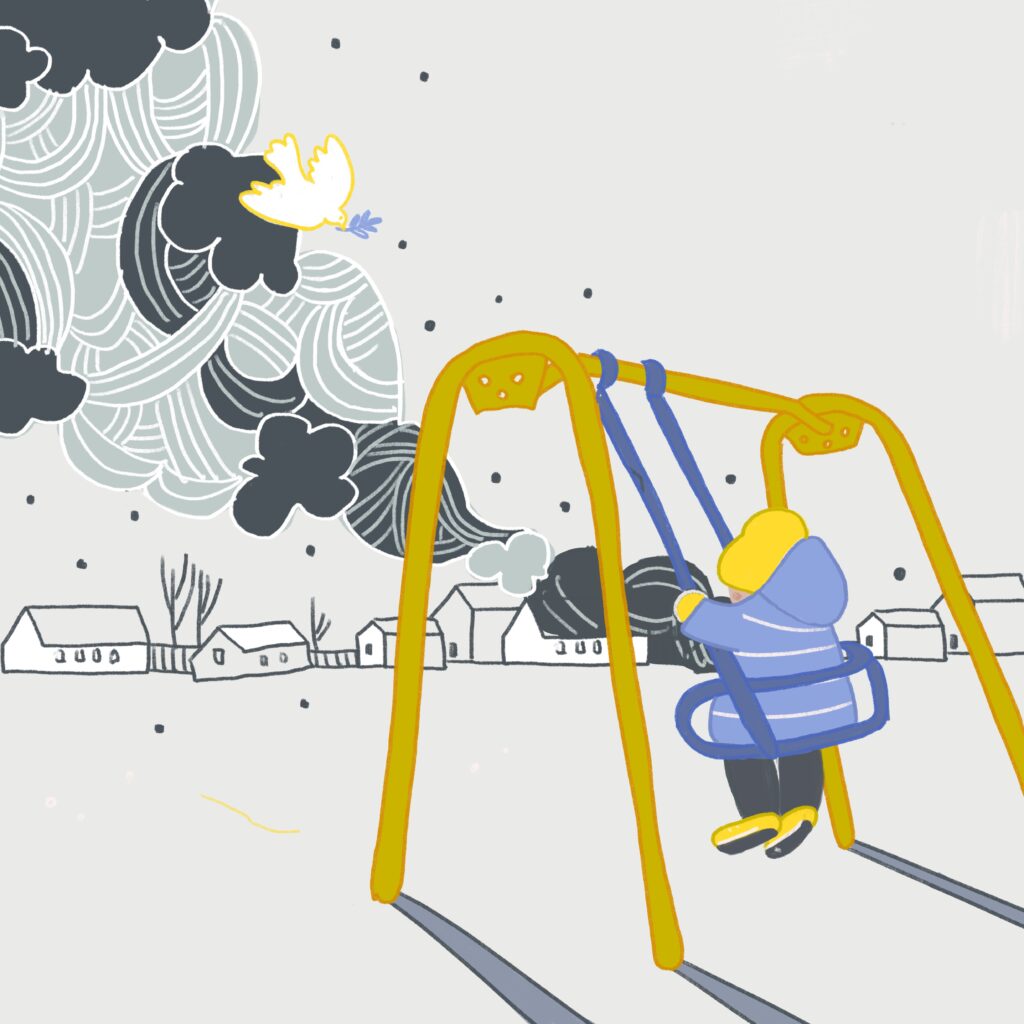
(15,070 posts)Or anyone else's visual work photo, or art or mixed.
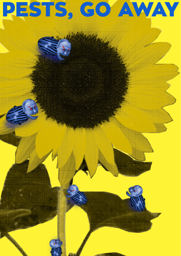
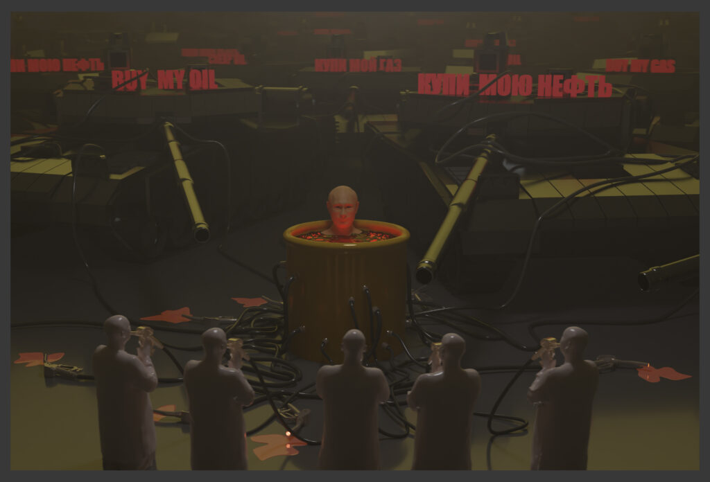
Donkees
(31,585 posts)Thank you very much for your help!🙏 It’s very important for us now. P.S. I created this mural a few days ago in Kyiv, and at that time nearby were battles for the liberation of Bucha and Irpin took place.
https://streetartutopia.com/2022/04/04/sasha-korban-created-this-mural-a-few-days-ago-in-kyiv/
electric_blue68
(15,070 posts)(I was a professional graphic designer)
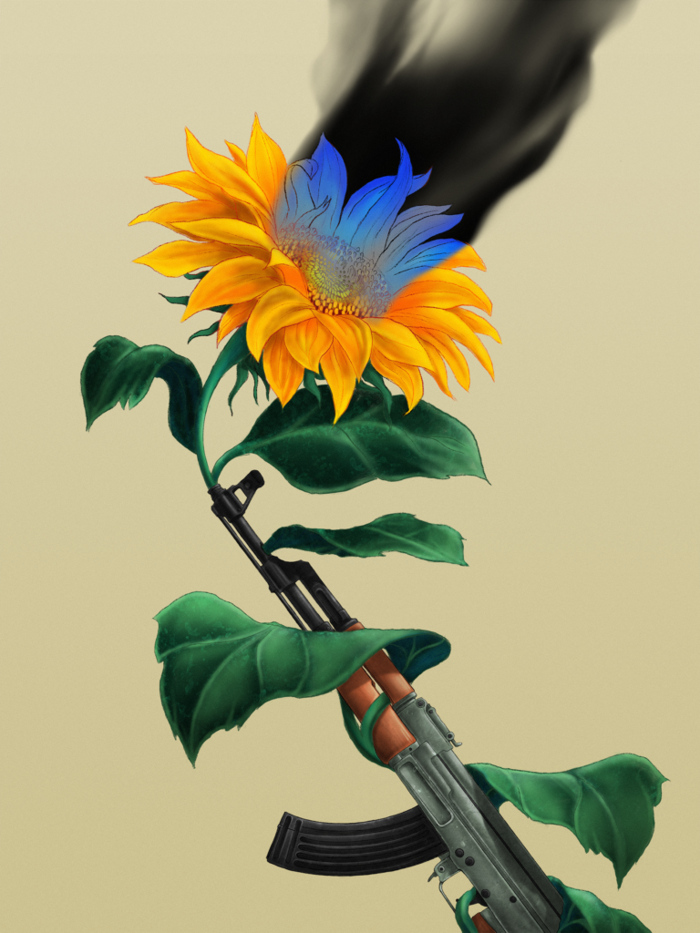
Make the space from the bottom of the "Ukraine" letters the same as from the top of the "DU For" letters to where the blue starts.
Then make (if you can) the sunflower about 15% smaller, and make the blue background the same size in height as the yellow background after you adjust it.
Those are my suggestions.
Omaha Steve
(99,981 posts)
Here is the logo info I have.
Sorry for the big size. Feel free to copy/steal/scale/edit.
Graphics from Wikipedia, so they are public domain.
Editing by GIMP https://www.gimp.org/
346K bytes
electric_blue68
(15,070 posts)my computer right now! Sorry.
Omaha Steve
(99,981 posts)Could you get to it by say Wednesday?
OS
electric_blue68
(15,070 posts)a graphics program on my computer because I don't have internet on it to get a free graphics program like Gimp.
I should explain - I did all my professional design AND Paste Ups & Mechanicals the old fashioned way:
with T-Squares, Triangles, and Letra Set back in the day.
I learned computer graphics, and art on other computers bc I didn't even have one back then.
Sorry, no can do!

Celerity
(43,941 posts)

electric_blue68
(15,070 posts)Celerity
(43,941 posts)https://creativesforukraine.com/about/
electric_blue68
(15,070 posts)Celerity
(43,941 posts)

Demovictory9
(32,521 posts)Demsrule86
(68,944 posts)electric_blue68
(15,070 posts)
DET
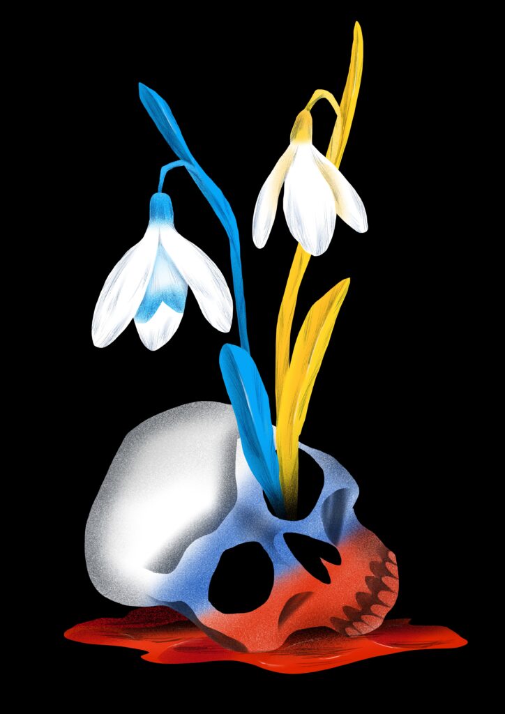
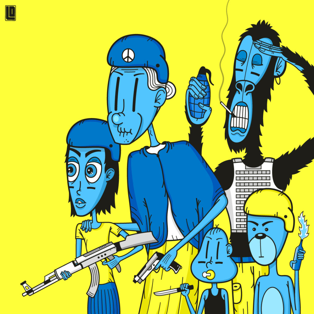
(1,347 posts)Same here. Keep it simple. Some of the other images are downright creepy.
Demovictory9
(32,521 posts)
Kick in to the DU tip jar?
This week we're running a special pop-up mini fund drive. From Monday through Friday we're going ad-free for all registered members, and we're asking you to kick in to the DU tip jar to support the site and keep us financially healthy.
As a bonus, making a contribution will allow you to leave kudos for another DU member, and at the end of the week we'll recognize the DUers who you think make this community great.