General Discussion
Related: Editorials & Other Articles, Issue Forums, Alliance Forums, Region ForumsIts official: Hillary Clintons logo is actually perfect

As soon Hillary Clinton announced her presidential bid, commentators began dissecting each and every aspect of her communications strategy. Despite a few critics, many noted that the launch video successfully installed Clinton’s campaign as a collective effort rather than emphasizing that Clinton was “destined” for the presidency.
What instead provoked nothing but bad reviews was the logo design—a patriotically blue, red and white “H” with an arrow pointing right at the center. Why is the arrow red (the Republican color in the US), some asked, and why is it pointing toward the right? Were voters going to interpret it as an imminent shift towards more conservative positions? Others plainly stated that the logo didn’t say anything at all. Quartz’s Anne Quito weighed in with the following:
Clinton’s new logo builds upon Obama’s “O,” which was much closer to a corporate brand than a traditional political logo.
more
http://qz.com/423037/its-official-hillary-clintons-logo-is-actually-perfect/
 = new reply since forum marked as read
Highlight:
NoneDon't highlight anything
5 newestHighlight 5 most recent replies
= new reply since forum marked as read
Highlight:
NoneDon't highlight anything
5 newestHighlight 5 most recent replies

Thinkingabout
(30,058 posts)
stonecutter357
(12,699 posts)
cali
(114,904 posts)

cantbeserious
(13,039 posts)eom
Wilms
(26,795 posts)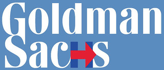
InAbLuEsTaTe
(24,128 posts)
Agschmid
(28,749 posts)Scuba
(53,475 posts)Evergreen Emerald
(13,071 posts)I think it is great.

Art_from_Ark
(27,247 posts)It's a right turn arrow.

olegramps
(8,200 posts)
karynnj
(59,511 posts)To me, putting the opposite way would look like it is going forward. However, I assume that they focus grouped both ways to see what worked better. I doubt Obama won BECAUSE of his logo -- and doubt that any candidate's standing is influenced by the quality of their logo.
Personally, I thought it ugly when I first saw it, but I am impressed after seeing it used with other colors and images superimposed on it.

tularetom
(23,664 posts)Reagrdless of what anybody with too much time on his hands wants to attribute to it.
And it sure as hell doesn't warrant thousands of words of analysis.
But I guess if you're trying to sell a crappy political candidate as a brand, and you don't want anybody to ask a lot of questions, you need a snappy logo.

Blue_Adept
(6,402 posts)And the ability to express it in interesting ways is definitely here.
It may not warrant analysis by you, but it does for others.
Otherwise this world would be a narrow, dull and uninteresting place.
I have no great love of fonts, for example, but there are some really great analytical pieces out there that when you read them, you understand more of what marketing is, interpretation and intent behind all sorts of materials.
To dismiss outright says more of you than people "with too much time on [their] hands"
InAbLuEsTaTe
(24,128 posts)kenfrequed
(7,865 posts)A logo is the province of advertising, not of issue raising. I prefer my presidents with a greater interest in policy rather than salesmanship.
sgtbenobo
(327 posts)Hillary should just go home.
Wherever that is.
President Sanders should have been President a long time ago.
Do you like peace?
Vote for Bernie.
Do you like responsibility?
Vote for Bernie.
JTFrog
(14,274 posts)"Wherever that is."
Be careful what you wish for.
The White House was her home for 8 years.
I would have no problem with her going home. Of course, I'd have no problem with Bernie in the White House either.


misterhighwasted
(9,148 posts)^G^O. ^H^O^M^E ^H^I^L^L^A^R^Y
MPOTUS 2016

Beacool
(30,254 posts)In January 2017 it will hopefully be 1600 Pennsylvania Ave., Washington DC.

Agschmid
(28,749 posts)
phantom power
(25,966 posts)
PatrickforO
(14,608 posts)phantom power
(25,966 posts)snooper2
(30,151 posts)
Spitfire of ATJ
(32,723 posts) [font size=5 color=red]alliburton[/font]
marmar
(77,131 posts)Exactly. ..... And very apropos.
merrily
(45,251 posts)
MineralMan
(146,354 posts)the election at all. I think this "controversy" is not worth a moment of anyone's time.
leveymg
(36,418 posts)

FlatBaroque
(3,160 posts)It would be laughable.

Romulox
(25,960 posts)
MADem
(135,425 posts)The only people crabbing about the logo are people who are not fans of the candidate. If their favorite had come up with an essentially similar logo, they'd be praising it to the skies.
Not even subtle, some of the carping...

hootinholler
(26,449 posts)Are people crabbing or carping?
Stop trying to mussel in on the action.
merrily
(45,251 posts)MADem
(135,425 posts)You WIN the thread!
I'm sure you'll be singing a different tuna in a minnow!
MADem
(135,425 posts)66 dmhlt
(1,941 posts)hootinholler
(26,449 posts)Glad it's officially perfect.
99Forever
(14,524 posts)..."deep " thoughts about superficial bullshit are as good a distraction as anything.

SidDithers
(44,228 posts)Sid
Blue_Adept
(6,402 posts)truebrit71
(20,805 posts)At least now she's being honest about her move to the right...
lame54
(35,359 posts)snooper2
(30,151 posts)leftofcool
(19,460 posts)Erose999
(5,624 posts)
Democrats go LEFT, not right for fucksakes!!
Blue_Adept
(6,402 posts)I mean, we read left to right here. The letter is in that direction. Setting it to the left like that just looks very awkward and stilted.
Sheepshank
(12,504 posts)I hate it.
Progressives move forward...we read left to right for crying out loud.
Spitfire of ATJ
(32,723 posts)misterhighwasted
(9,148 posts)Put Hillary's logo on my Tshirt and it points to my left.


pnwmom
(109,028 posts)No, thanks.
Erose999
(5,624 posts)or any number of other bad decisions that can be directly attributed to the Clinton dynasty. Back to the New Deal, strong unions, higher tax rates on the 1%, etc etc.
Agschmid
(28,749 posts)You also realize that she didn't single handedly send troops to Iraq right?
I get it she certainly voted for the resolution I don't deny that... But she did not "cause" the war.
A republican in the White House caused the war, people in power lying to the nation helped "cause" the war.
pnwmom
(109,028 posts)There never was a perfect era. All we can keep doing is pushing ahead and fighting for our future.
Erose999
(5,624 posts)tightening of corporate screws. BOTH of them. Hillary and Bill are the DLC, Turd Way, etc etc.

Wash. state Desk Jet
(3,426 posts)What is interesting about it I think ,is that the logo by it's design will evolve as the campaign picks up steam moving the train along at a progressive pace. The logo at some point in the action will be given voice or will take on voice. The controversy surrounding the launch of the logo adds to it's mystique. It speaks now though not yet recognized in depth.
Even if you don't like the candidate ,the message is a good one. How bout, (lets keep the country moving in the right direction.)
The reverse direction could be a reflection of setting it back or turning it back. Pointing upward could reflect moving on and up or even up through the dome, however one will choose to view it in voice. And down of course pointing downward could be a reflection of well, thumbs down ,or you know, the the GOP's way.
So you can look at it in multiple perspectives or you can look at it to say one definitive thing . What it comes down to is it's all in how you see it. The thing of it is ,it will evolve by it's design as the campaign picks up momentum. If the voice becomes one collective voice nation wide, the republican party will return to it's former republican reform party tactics as a result of it !
Young republican reformers ring any bells ! Oh Ronnie !
Response to n2doc (Original post)
Name removed Message auto-removed
jalan48
(13,919 posts)
Starry Messenger
(32,342 posts)Therefore, it *is* perfect.
misterhighwasted
(9,148 posts)
Kudos to Hillary's genius Team.
Beacool
(30,254 posts)I stopped caring about their opinion years ago.
KamaAina
(78,249 posts)
Throd
(7,208 posts)One can drop stock photo images into any shape.
pnwmom
(109,028 posts)Whatever you feel about Hillary will be reflected in how you see her logo.

MisterP
(23,730 posts)or a family unit that'll have to stick together until the girl's 50 because enough people figured that "if a candidate has boobs, that means they won't wreck the economy or continue endless war"

daredtowork
(3,732 posts)If it was perfect, you shouldn't have to keep justifying it.
The logo is Hillary's calling card. It's important. Though I admit, nothing is going to convert me to Hillary unless she walks back her "purple triangulation" speech, comes out against TPP, and develops a welfare policy that's both a true safety net as well as a ladder out of poverty, I still wish the woman with the best chance to become the first female POTUS was a woman I'd want to vote for. Therefore, I'm throwing in some friendly logo advice.
The current logo isn't a winner. Stop defending it: start looking for a new one.
Btw, I was just reading a book called "Just My Type" that claims the Gotham typeface helped Obama win in 2008.
awoke_in_2003
(34,582 posts)This just proves she is a republican.  just in case