| Latest | Greatest | Lobby | Journals | Search | Options | Help | Login |
|
|
|
This topic is archived. |
| Home » Discuss » Archives » General Discussion: Presidential (Through Nov 2009) |
|
| THUNDER HANDS
|
Thu Jan-10-08 05:07 PM Original message |
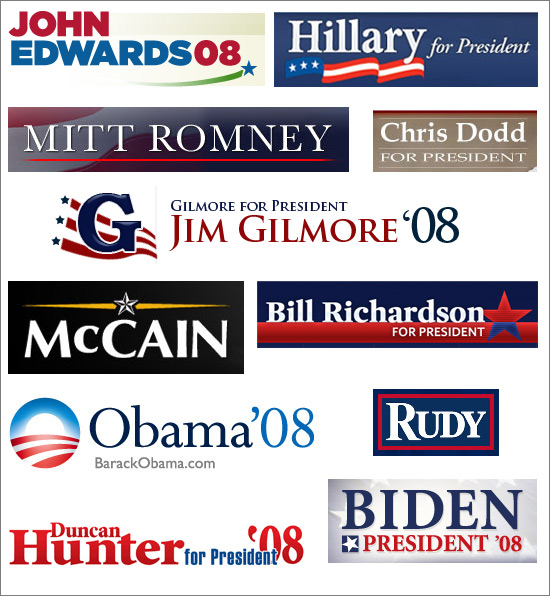
| Poll question: Just By Looking At The Designs, Which Candidate Has The Best Bumper Sticker? |
| Printer Friendly | Permalink | | Top |
| golddigger
|
Thu Jan-10-08 05:08 PM Response to Original message |
| 1. My man Edwards of course! n/t |
| Printer Friendly | Permalink | | Top |
| polichick
|
Thu Jan-10-08 05:09 PM Response to Original message |
| 2. I like these best... |
| Printer Friendly | Permalink | | Top |
| THUNDER HANDS
|
Thu Jan-10-08 05:10 PM Response to Reply #2 |
| 6. does Hillary's really say "I'm your girl?" |
| Printer Friendly | Permalink | | Top |
| polichick
|
Thu Jan-10-08 05:13 PM Response to Reply #6 |
| 16. Lol |
| Printer Friendly | Permalink | | Top |
| Bicoastal
|
Thu Jan-10-08 05:09 PM Original message |
| Fred Thompson will get around to making a bumper sticker one a these days... |
| Printer Friendly | Permalink | | Top |
| GodlessBiker
|
Thu Jan-10-08 05:13 PM Response to Original message |
| 15. He's coming out with complimentary buggy whips and hat pins. |
| Printer Friendly | Permalink | | Top |
| LiberalinNC
|
Thu Jan-10-08 05:09 PM Response to Original message |
| 3. Dodd sticker is so boring. |
| Printer Friendly | Permalink | | Top |
| Muttocracy
|
Thu Jan-10-08 06:26 PM Response to Reply #3 |
| 44. some different ones? |
| Printer Friendly | Permalink | | Top |
| redqueen
|
Thu Jan-10-08 05:10 PM Original message |
| I'm sorry to say it... but Romney. |
| Printer Friendly | Permalink | | Top |
| Elidor
|
Thu Jan-10-08 05:11 PM Response to Original message |
| 8. I agree |
| Printer Friendly | Permalink | | Top |
| redqueen
|
Thu Jan-10-08 05:12 PM Response to Reply #8 |
| 12. Thank you. |
| Printer Friendly | Permalink | | Top |
| Common Sense Party
|
Thu Jan-10-08 05:12 PM Original message |
| Yeah. Romney's and Richardson's have the best designs. nt |
| Printer Friendly | Permalink | | Top |
| redqueen
|
Thu Jan-10-08 05:24 PM Response to Original message |
| 31. Yeah... |
| Printer Friendly | Permalink | | Top |
| Cameron27
|
Thu Jan-10-08 05:26 PM Response to Original message |
| 34. Yes, I think so too. |
| Printer Friendly | Permalink | | Top |
| Kucinich4America
|
Thu Jan-10-08 05:12 PM Response to Original message |
| 10. I'd have to agree |
| Printer Friendly | Permalink | | Top |
| Common Sense Party
|
Thu Jan-10-08 05:12 PM Response to Reply #10 |
| 14. It should be the best. He spent $88 million on the design! nt |
| Printer Friendly | Permalink | | Top |
| gateley
|
Thu Jan-10-08 05:12 PM Response to Original message |
| 11. Ditto. Easy to read, simple, classy. Killed me to vote for it, though. :-) |
| Printer Friendly | Permalink | | Top |
| redqueen
|
Thu Jan-10-08 05:14 PM Response to Reply #11 |
| 17. Hahaha |
| Printer Friendly | Permalink | | Top |
| Common Sense Party
|
Thu Jan-10-08 05:10 PM Original message |
| I love how Duncan Hunter's apostrophe goes the wrong way. |
| Printer Friendly | Permalink | | Top |
| El Supremo
|
Thu Jan-10-08 05:10 PM Response to Original message |
| 4. It's all about the O. |
| Printer Friendly | Permalink | | Top |
| Nailzberg
|
Thu Jan-10-08 05:10 PM Response to Original message |
| 5. Edwards. I've never liked the Obama logo against a white background. |
| Printer Friendly | Permalink | | Top |
| Atman
|
Thu Jan-10-08 05:10 PM Response to Original message |
| 7. Edwards and Obama most graphically appealing...but who is advising McCain? |
| Printer Friendly | Permalink | | Top |
| Common Sense Party
|
Thu Jan-10-08 05:15 PM Response to Reply #7 |
| 21. Isn't the star supposed to look like the one on a general's uniform? |
| Printer Friendly | Permalink | | Top |
| GodlessBiker
|
Thu Jan-10-08 05:11 PM Response to Original message |
| 9. Obama's appears fresher to me, and it is the only one with his website. |
| Printer Friendly | Permalink | | Top |
| Muttocracy
|
Thu Jan-10-08 05:59 PM Response to Reply #9 |
| 42. My Biden one had JoeBiden.com n/t |
| Printer Friendly | Permalink | | Top |
| zanne
|
Thu Jan-10-08 05:12 PM Response to Original message |
| 13. There's nothing like sunrise and a new day. |
| Printer Friendly | Permalink | | Top |
| El Supremo
|
Thu Jan-10-08 05:15 PM Response to Original message |
| 18. Here is a funnier one. |
| Printer Friendly | Permalink | | Top |
| katsy
|
Thu Jan-10-08 05:15 PM Response to Original message |
| 19. Torn between mittens & Obama. |
| Printer Friendly | Permalink | | Top |
| redqueen
|
Thu Jan-10-08 05:17 PM Response to Reply #19 |
| 23. But you did find Mitt's more appealing? |
| Printer Friendly | Permalink | | Top |
| katsy
|
Thu Jan-10-08 05:19 PM Response to Reply #23 |
| 26. yes. |
| Printer Friendly | Permalink | | Top |
| redqueen
|
Thu Jan-10-08 05:23 PM Response to Reply #26 |
| 29. Ah no... you're not voting for him, just the sticker design. |
| Printer Friendly | Permalink | | Top |
| last_texas_dem
|
Thu Jan-10-08 05:15 PM Response to Original message |
| 20. I like Richardson's the most |
| Printer Friendly | Permalink | | Top |
| polichick
|
Thu Jan-10-08 05:16 PM Response to Original message |
| 22. Red, white and blue might seem too obvious... |
| Printer Friendly | Permalink | | Top |
| Barack_America
|
Thu Jan-10-08 05:18 PM Response to Original message |
| 24. Obama and McCain's are my favorite. Guiliani's is good as well. |
| Printer Friendly | Permalink | | Top |
| Clintonista2
|
Thu Jan-10-08 05:19 PM Response to Original message |
| 25. I like Romneys |
| Printer Friendly | Permalink | | Top |
| jillan
|
Thu Jan-10-08 05:20 PM Response to Original message |
| 27. Obama's O is amazing. We actually had a discussion about it in the Biden group. |
| Printer Friendly | Permalink | | Top |
| Muttocracy
|
Thu Jan-10-08 05:38 PM Response to Reply #27 |
| 35. for Biden - the nut and bolt |
| Printer Friendly | Permalink | | Top |
| jillan
|
Thu Jan-10-08 06:31 PM Response to Reply #35 |
| 45. That definitely would have been better! |
| Printer Friendly | Permalink | | Top |
| Muttocracy
|
Thu Jan-10-08 06:34 PM Response to Reply #45 |
| 46. I think Joe would laugh at the microphone too :) |
| Printer Friendly | Permalink | | Top |
| Guy Whitey Corngood
|
Thu Jan-10-08 05:22 PM Response to Original message |
| 28. Why is Chris Dodd so unpatriotic? |
| Printer Friendly | Permalink | | Top |
| Snotcicles
|
Thu Jan-10-08 05:24 PM Response to Original message |
| 30. Rudy' should have been |
| Printer Friendly | Permalink | | Top |
| Muttocracy
|
Thu Jan-10-08 05:39 PM Response to Reply #30 |
| 36. :-) with flaming towers in background |
| Printer Friendly | Permalink | | Top |
| Bongo Prophet
|
Thu Jan-10-08 07:17 PM Response to Reply #36 |
| 49. Saint Rudy of the Rubble. Yep. |
| Printer Friendly | Permalink | | Top |
| Beausoir
|
Thu Jan-10-08 05:24 PM Response to Original message |
| 32. McCain's reminds me of Red Square. |
| Printer Friendly | Permalink | | Top |
| parasim
|
Thu Jan-10-08 05:25 PM Response to Original message |
| 33. From this professional designer's perspective, I'd have to say Obama's, then Edwards' |
| Printer Friendly | Permalink | | Top |
| Muttocracy
|
Thu Jan-10-08 05:42 PM Response to Original message |
| 37. Romney, Rudy, McCain |
| Printer Friendly | Permalink | | Top |
| Catherine Vincent
|
Thu Jan-10-08 05:46 PM Response to Original message |
| 38. Romney and Richardson, in that order. |
| Printer Friendly | Permalink | | Top |
| goodhue
|
Thu Jan-10-08 05:50 PM Response to Original message |
| 39. Why no Kucinich? |
| Printer Friendly | Permalink | | Top |
| Throd
|
Thu Jan-10-08 05:57 PM Response to Original message |
| 40. Romney. The transparent blue gradient over the stripes works well. |
| Printer Friendly | Permalink | | Top |
| Bongo Prophet
|
Thu Jan-10-08 07:19 PM Response to Reply #40 |
| 50. I voted ROMNEY also. Looks expensive, yet vague, vain and vacuous. Fit him like glove! |
| Printer Friendly | Permalink | | Top |
| Muttocracy
|
Thu Jan-10-08 08:04 PM Response to Reply #50 |
| 52. :) |
| Printer Friendly | Permalink | | Top |
| Occam Bandage
|
Thu Jan-10-08 05:58 PM Response to Original message |
| 41. In order, Obama, McCain, Romney. |
| Printer Friendly | Permalink | | Top |
| damntexdem
|
Thu Jan-10-08 06:01 PM Response to Original message |
| 43. None of the above. |
| Printer Friendly | Permalink | | Top |
| GreenArrow
|
Thu Jan-10-08 07:01 PM Response to Original message |
| 47. Obama's is best. |
| Printer Friendly | Permalink | | Top |
| Nimrod2005
|
Thu Jan-10-08 07:02 PM Response to Original message |
| 48. Hillary's is sooooooo traditional, more of the same...nt |
| Printer Friendly | Permalink | | Top |
| krabigirl
|
Thu Jan-10-08 07:41 PM Response to Original message |
| 51. McCain's. It 's different, and it looks militarish. Also like Richardson's. |
| Printer Friendly | Permalink | | Top |
| Bishop Rook
|
Thu Jan-10-08 08:07 PM Response to Original message |
| 53. I was torn between Romney and Obama |
| Printer Friendly | Permalink | | Top |
| DU
AdBot (1000+ posts) |
Thu May 16th 2024, 08:43 AM Response to Original message |
| Advertisements [?] |
| Top |
| Home » Discuss » Archives » General Discussion: Presidential (Through Nov 2009) |
|
Powered by DCForum+ Version 1.1 Copyright 1997-2002 DCScripts.com
Software has been extensively modified by the DU administrators
Important Notices: By participating on this discussion board, visitors agree to abide by the rules outlined on our Rules page. Messages posted on the Democratic Underground Discussion Forums are the opinions of the individuals who post them, and do not necessarily represent the opinions of Democratic Underground, LLC.
Home | Discussion Forums | Journals | Store | Donate
About DU | Contact Us | Privacy Policy
Got a message for Democratic Underground? Click here to send us a message.
© 2001 - 2011 Democratic Underground, LLC
 ><
>< ><
>< >
>
